I must admit that I didn't think a random email from a woman in Hong Kong would result in the production of this spectacular wedding at 620 Loft and Garden overlooking Rockefeller Center and St. Patrick's Cathedral. It was just a little over a year ago that Tiffany emailed me, noting that she had read my blog (yay! yay! yay!) and wanted to discuss her New York City wedding. Those of you in the wedding industry can probably relate to the fact that I get some pretty unusual emails from overseas - everything from requests for business partnerships with companies in Qatar to inquiries about taking lump sum payments for weddings via credit card and then refunding the balance in cash (yeah, right!). So, it was extra delightful that Tiffany was serious about teaming up for a modern, chic, City wedding!
Working solely via email and Skype for most of the process certainly did have its challenges, but thankfully both Tiffany and I are serious night-owls so we could schedule our communications strategically despite the 13 hour time difference. We did have two opportunities to meet in person throughout the planning and design process, and on those occasions we powered through dozens of site visits, story boards, dress appointments and sample showings to yield all of the amazing details that united to be an amazing celebration for Tiffany and Rich.
If you Google the phrase "urban oasis" I think that this venue, 620 Loft and Garden, should be the top result. Where else can you find a sky-high, perfectly manicured garden adjacent to a stark, clean loft with million dollar views? I could have done nothing at all and this place would have been amazing, but that would have been no fun at all...
The ceremony took place in the garden which seats just 90 guests. The scale is small, but the impact is big, so it was important to do just enough to personalize the space without overwhelming it. We built a small arch of curly willow dotted with orchids and anchored it in a bed of flowers on modern white columns detailed with the couple's monogram. Ana Dolan adapted the custom pattern we created for all of the printed pieces for this wedding and designed beautiful program fans - which definitely helped on this hot, sunny day!
Guests found their escort cards inside the loft amidst a tray of crystals. Tiffany loves chandeliers and since we were unable to hang any in the space, I found these free-standing ones at Luxe Event Rentals. To finish off the home interior inspired look, I printed a wall art series using their customized lace pattern.
To soften the look of the loft, I added sheer curtains to all of the windows in the loft space using tension rods ("trick of the trade" alert: so easy and so cheap!) as well as covered the main focal point wall with soft white drapery that was swagged open at the entry points. A mix of long and round tables added interest and helped to nestle in all of the guests to the petite room.
Tiffany really liked my lucite stands, but she wanted them to have a little extra "something," so I added crystal strands for some sparkle and to enhance the look of the candlelight. All of the gold vases were brimming with peonies, spray roses and orchids for a look that was both modern and romantic. Hints of black added an edginess that nicely balanced some of the lace detailing on the menus, table numbers and other printed elements.
I've really been enjoying adding a little detail to the bride and groom's chairs, so I couldn't help but make these monogrammed chair caps to finish off the look.
[As a little side note, how AMAZING are my floral designers?? Brenda, Lori, Viktoriya and Gabrielle - I adore you and am endlessly grateful to have you on my team!]
Photos by Gustavo Campos
Tiffany and Richard were truly passionate about all of the details of their wedding which pushed me to think and re-think each aspect of their day. The end result? Spectacular. Amazing. Special. Just like the couple.
Thursday, October 27, 2011
Monday, October 3, 2011
Ines' Funky and Fun Birthday Surprise
This gig was just plain fun. When a great client calls and tells me that I can pick a cool place for a cool party and it just needs to look and feel cool, well.... that's just cool. It was a special birthday for long time client Ines, and her husband Augusto wanted to surprise her with a birthday bash (check out their wedding here). The only requirement is that it needed to be a venue with a view. With that in mind, there was only one choice for me - SoHi at the new Trump SoHo Hotel has the sickest view of New York that I have ever seen, so it was a shoo-in.
We put together a station-style menu for this relaxed party which means that tables would not be fully set with china, silver and glassware. This makes for a very important decor challenge: how to still make the table look interesting and full when, indeed, it is not full. The answer? A patterned tablecloth! A plain, solid cloth can look empty when there is not a charger plate, silverware, etc. so bringing in a cloth with pattern or texture provides visual interest in lieu of the other elements.
Since Ines and Augusto have small children (see one of their birthday celebrations here), they wanted to include their own kids as well as the children of their guests. To give them a little something to do while the adults were eating, we created a kids' craft table with stickers, crayons, pipe cleaners, wax sticks and other fun goodies. I also used a lower table and kids' chairs so that they would feel extra comfortable.
SoHi has very cool little nooks in the walls opposite the windows so we carried the floral concept through to add more color around the room. One of the greatest features of this space, though, is the honeycomb ceiling with color changing LED's which provides both color and texture.
You know it is not a party without a cake - and this cake rocked! My buds Leslie and Mark at Mark Joseph Cakes worked with me to translate the style of this party into this modern, square cake that was one of the biggest "wows" of the night.
All photos by Sharon Schuster
How do you feel about all the pink? It was definitely the color of the season at LLE, so stay tuned for more!
Friday, September 30, 2011
Emily's Fashionable Fete
For me, Bar and Bat Mitzvah design is always a unique challenge. It involves balancing the needs and desires of both an adult and a teenage client, and, more importantly, it usually involves convincing someone that a party with a theme need not have either foam core centerpieces or anything that lights up and flashes. This lovely New York City Bat Mitzvah at the Central Park Boathouse was no different, however it didn't take too much negotiation to get both the parents and the Bat Mitzvah girl on board with a unique twist on a fashion design theme.
Emily is a budding fashion illustrator - it is one of her hobbies and I must say that I was blown away by the caliber of her sketches. So, while many girls her age want a Bat Mitzvah theme that has to do with fashion magazines, shopping or popular brands, Emily had something much more elevated in mind (yay for me!). We didn't focus at all on fashion as an outcome, but instead on fashion as a process. One thing was non-negotiable though... PINK! Emily loves pink and wouldn't consider straying from it for a minute.
The first thing my design team worked on was establishing a logo that was both elegant and youthful and that tied into the theme without being too blatant. We decided on a hand illustrated bust form with Emily's name draping around the neck like a tape measure. Talented stationer Ana Dolan used this motif to create a variety of printed pieces for the party.
Next, I wanted to have a creative way to display the escort cards that tied into the theme, so after a lot of thought, I decided to use Emily's sketches as inspiration to create 3-D moodboards. We worked backwards from some of Emily's best sketches and added fabric swatches, ribbons and beads to frame the cards themselves.
For me, the flowers were a no-brainer. Emily's parents wanted to have elegant, tasteful centerpieces that were seasonal and simple, but Emily wanted to be sure the theme carried through. So, on half of the tables, we created lush trios of peonies, roses, hydrangea, orchids and calla lilies in varying shades of pink. On the other half of the tables, though, I sourced beautiful painted wire dress forms, set them on a base of full flowers coordinating with the other tables and accented them with a "belt" of pink roses so that the wire wouldn't feel too harsh.
In the lounge area for the kids, we needed just a few small floral accents, so I pounded the pavement for days to find pink high heels to use as vases for these sweet cocktail pieces.
Finally, since everyone in NYC is crunched for space, I wanted to help Emily's family avoid the problem of the huge sign-in board that often needs to find a permanent home in a small apartment. I purchased a pink (of course) cocktail dress and accessorized it with a brooch and a necklace on my trusty mannequin (affectionately nicknamed Violetta by my staff!) and allowed the guests to offer their congratulations to Emily by signing the dress! This way she can still keep it forever, but neatly hung in her closet or folded in a drawer.
All photos by Sharon Schuster
Another fun party for another great family. Sometimes I wonder how I got so lucky...
Happy fall!
*Thanks to Lenox Hill Florist for acting as my floral production partner for this event.
Monday, September 12, 2011
NewlyWish at The Wedding Salon
Let me start by saying that I know I have been off the blogosphere for an embarrassingly long time and I'm sorry. The summer wedding whirlwind got the best of me, but I have desperately missed writing in this forum and I have SO many great events and designs to share. So, at long last... I'm baaaack!
I am going to make a feeble attempt at getting caught up, so let's turn back the clock to the first days of Spring when I was so kindly invited, once again, to design a tabletop for my friends at NewlyWish to show off their amazing registry wares to the thousands of NYC brides who make their way through The Wedding Salon bridal event. Since NewlyWish goddess Amanda Allen and I have gotten in a bit of a design groove (see previous projects here and here), I wasn't given too much direction for this project. All I had to go on was that she wanted to feature these adorable new Ink Dish plates and she wanted to introduce brides to the idea that NewlyWish is not just for registries but also for all occasion gift giving.
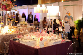
The Wedding Salon events are always sold out, for brides and for vendors. So, it is the type of venue in which vendors need to stand out or they'll be overwhelmed by the sheer amount of traffic and chaos that goes on around them. Knowing this, I wanted to introduce as much sparkle and intrigue as I possibly could in just a 6'x6' area. I brought in one of my trusty mirrored tabletops and topped a mulberry linen with it to amplify the glimmer that we would create with candlelight. I also used one of the custom built acrylic towers that I debuted at Cindy and Brent's wedding to give the NewlyWish table the height it needed to stand out in the crowd.
I took a very literal approach to the gift-giving concept that Amanda wanted to introduce since the environment of a bridal show doesn't always allow for much conversation. Instead of using a traditional charger plate, I filled a paper gift box with a pave of white carnations (yup, carnations sometimes do the trick!) and used it as the base for the layered Ink Dish china on display. The coordinating box tops were adorned with lush fabric bows in perfectly matched pink.
The centerpiece was a collection of small cylinder vases filled with the first peonies of the season along with light pink roses and calla lilies. To modernize the uber-feminine pieces just a bit, I added dramatic loops of black wire dotted with pink orchids which connected the five vases in the middle of the table. I also wrapped each of the vases in soft Japanese paper that I purchased in error for another client... See, no one can tell me I'm not a little bit green!
All photos by Allan Zepeda
As always, I had a great time putting this table together and flexing my design muscles a bit. I'm looking forward to the next NewlyWish tabletop project already!
I promise I'll be back sooner rather than later. Thanks for being patient with me!
Sunday, June 26, 2011
Pretty weddings for everyone!
This was a really big week for weddings in New York. Huge. Finally, finally, finally New York State legislature has signed a bill that will allow same sex couples to marry. It is a wonderful time to be in New York and to work in the business of weddings, and the outpouring of excitement from every end of the wedding industry is exhilarating.
I am not much into politics and there are few political issues that ignite my passion, so I will not ever bring politics into my work or into my blog. I am, however, unendingly passionate about weddings. So, in the weeks and months leading up this monumental bill, many of my friends within the wedding industry have been asking how I might prepare my business for this big political change. How will I handle all of the gay couples that may be calling me?
So, when faced with the materialization of this big news and all of the questions about what I will do differently, I have been putting a lot of thought into it. What WILL I do differently when I get a higher volume of inquiries for same sex weddings?
Brace yourselves, because you know that I'm not one for holding back...
Nothing. I will do nothing differently.
I have been creating amazing weddings for amazing people, gay and straight, for nearly a decade. All races, all religions, all political affiliations and all cultures, in New York, around the country and around the world. I learn about people through the eyes of their weddings. I learn about their families, what they love to do, their favorite colors, foods, music and fashion. I learn about how and where they grew up and how and where they live now. I learn because I ask questions and then listen to the answers - and sometimes beyond the answers. I then take all that I have learned about my clients and I translate it into the most beautiful and personal event that I can. That is what event design is to me.
So, whether you are gay or straight, Hindu or Jewish, Armenian or Portuguese, if you call me I am going to do everything in my power to make you an amazing wedding. That is the bill I signed into law the day I opened my doors.
Let's hear it for New York...
Sunday, May 29, 2011
Cindy and Brent: A Warm Winter Wedding
After many years together, Cindy and Brent knew that once they decided to get married, they didn't want a long engagement. So, when I got a call in mid-October that there were less than four months to plan and design a big, luxurious wedding for this lovely couple, I knew we had to jump right into the details. At our first meeting Cindy and her mom decided that they liked purple and shortly thereafter we moved forward with a palette using various shades of purple from lavender to eggplant and accent it with antique gold to bring a little warmth to what promised to be a cold February day.
All photos by Sofia Negron
I created a huge escort table, fitted with an amethyst cloth and covered with a mirrored tabletop. Pearlescent purple cards were hand calligraphed with white ink for a dramatic contrast.
We mixed long and round tables and incorporated three different centerpiece styles to create interest in the ballroom.
Tall acrylic stands held full, elongated floral pieces with bold arches made of curly willow and accented with orchids. The ballroom boasts a beautifully detailed 30 foot ceiling, so it was important to use elements which drew the eye upwards. Dozens of floating candles decorated the tabletop and added a luminescent glow to the room.
Smaller acrylic stands held candles on top and had bases filled with lush floral arrangements.
To highlight the beautiful gold rimmed chargers, we incorporated round menus from Ana Dolan which fit perfectly within the rim of the plate. The custom monogram that we designed for the couple carried through the wedding.
Because the resident caterer has an in house baker, we requested that she create a cake with no design at all and then I adorned it with two types of purple ribbon and hand made sugar flowers from Sugar Flower Shop. This is a great alternative when a great baker is not a great decorator.
For a sweet finish, guests left with French macarons in four pretty colors, each of a different flavor.
This was just a taste of all of the gorgeous details of the day. Check our Facebook page in the coming weeks for the complete album. Many thanks to Sofia Negron for all of the beautiful photos.
Thursday, May 5, 2011
New York Tent Industry Bash: Pink meets Industrial Chic
Imagine you are a designer. Fun! And someone asks you to design a party in a tent. Cool! And the tent is in a parking lot. Ok. And guests enter the tent through a warehouse. Mmmhmmm. And the warehouse is in an office park on Long Island. Seriously? Yup. That, my friends, is a day in the life!
I know it sounds totally nuts, but this event industry party was so crazy cool that when all was said and done, the warehouse and the parking lot and the whole thing made perfect sense! It was a great honor to be invited to partner with New York Tent for their annual industry showcase and celebration and to have the opportunity to collaborate with my good friends at Sterling Affair catering to create an atmosphere that highlighted their cuisine.
My design inspiration blossomed when Peter of Sterling Affair selected a stainless and mirror bar that he wanted to use for food service from furniture rental partner Greenroom. After looking at a photo of the piece, I thought I would run with the stainless steel concept, especially since the palette for the party had been set as Honeysuckle pink (Pantone color of the year) and gray. Then, I began to think about the unusual setting for the party in the New York Tent warehouse and what types of things may be there and I began to get really excited about creating what I decided to call "industrial chic."
Once the concept began to develop I was hit with an epiphany that dated back ten years... I had seen an exhibit at the Philadelphia Flower Show in which the designer covered a tabletop with nuts and bolts, topped it with glass and then set it with beautiful china. I had a snapshot of that table in my mind for a decade because I just adored the juxtaposition of the industrial and the refined and this was finally the moment to put that inspiration to use! Lucky for me, Home Depot sells Honeysuckle pink spray paint so that I could pull the whole concept together.
To brand Sterling's and my area of the tent - an elevated platform that created a second level (!!) - I designed a cog pattern that I used on the bars and table tops which spoke to our theme. I love using inexpensive and easy vinyl transfers to put my personal stamp on existing fixtures.
In the cores of my beautiful glass vases from Sandy and Mike's wedding, I inserted PVC pipes that I painted silver and then in the space between the pipe and the glass I layered jumbo hex nuts and bolts, some painted pink to add a little bit of "chic" to my "industrial." An edgy combo of pink flowers accented with black wire echoed the contrast I was trying to create throughout the space as I combined soft, romantic peonies with sleek, sexy calla lilies... and they lived together in perfect harmony!
To push my industrial chic obsession to the limit, I wanted to imagine a piece that I could hang over Sterling's signature chocolate bar that would catch guests' eyes as they entered the tent on the ground level and looked up to our open, second level platform. After a little bit of research, I because smitten with lighting designer Michael McHale's TDF copper pipe chandeliers, so I had to try and make a little one of my own. I used galvanized plumbing pipes with mismatched joints to create a frame and then wired it with sparkling crystal strands. The talented team at Luminous Designs lit it perfectly and created connectivity throughout the space by projecting cog patterned gobos on the floor.
The final piece of the puzzle was a last minute addition to include some extra guest seating. Rental partner Party Rental, Ltd. provided raw bars (generally filled with ice and then topped with seafood) which I filled with crystals and then placed trays of silver and pink nails down the center and closed off the raw bar with a piece of clear lucite. We added some tall stools and - voila! - bar-style seating!
If you can't tell, I had a pretty good time channeling my inner construction worker to show my industry friends a little bit of the crazy that goes on in my mind. Now that I got that nut and bolt thing out of my system, I don't know what will be next...
Thank you to the talented Mel Barlow for these photos. If you want to see what the other amazing design team of Claire Bean Floral Design and Brent Newsome Catering did, check out Mel's blog.
Til next time,