Showing posts with label interior design. Show all posts

Thursday, September 2, 2010

Inspired by: Kelly Wearstler

I have found my design soul mate. There's no one else I want to be with for the rest of my days. Kelly Wearstler: you are THE ONE.


I have long been an admirer of Kelly's work, but it was not until my darling clients Katie and James gave me the world's most thoughtful gift of a big ol' pile of design books (inspiring many more posts, I'm sure!) that I got to spend two uninterrupted hours with Kelly and her work. Page after page of Modern Glamour: The Art of Unexpected Style spoke to me... and in many ways echoed me. I heard myself in Kelly's words and saw my visions in the photos of her work. So, just like when you meet that special someone who can complete your sentences, I knew that my love for Kelly was here to stay.


By now you must know that I am endlessly charmed by language, so Kelly's crystal clear way in which she defines some of her basic design principles is amazing. I could list every pull quote from the book because so many of them are brilliant, but it is her focus on the key principle of unexpected style from so many different angles that I think is captivating:
"Eclecticism produces excitement through creative tension. Eclectic interiors may startle you at first, but its that surprising quality that hold you there and calls you back again." Two sentences that perfectly state what it took me two posts to convey (See: Unlikely Pairs and Mixed Media).

Now - I am going to say something bold here - and you are just going to have to live with it: every outfit, room, piece of stationery... you name it... is better with black. I thought that maybe I had been in New York too long because my love for black is so sincere, but after pouring over Kelly's images, I have found both a kindred spirit and a sense of validation. There is black in every room. Maybe a little or maybe a lot, but always black. I know it is not for everyone or every party (settle down, brides, I won't put black in your design if you don't want it!) but it excites me every time I see black in a good design and I never tire of it.


I could go on and on, but I'll just point out one more thing about my kindred spirit: Kelly says in her chapter on Color and Texture that "Living without color is like living without love." It seems overly dramatic, particularly in reference to event design, but her bold mantra spoke to me because of my daily interaction between color and love... weddings. Since Katie picked out this book for me, I will use her as my example (hope you don't mind, Katie!): early on when she and I were working on the design for her wedding and I had proposed a few color palettes, Katie called me one evening to say that she thought maybe she should just go with all white for her wedding. It was too hard to decide on a color palette and maybe going with white would be easier and safer so she wouldn't have to over-commit to just one shade. Katie was certainly not the first and will definitely not be the last to sing the song of white's safety to me... picking a color and using it as the main stamp on the key event of your lifetime is a BIG DEAL. Huge. Like picking your mate. You are saying to the world that you have one day to show off the essence of your life and this is the person you are picking, and this is the dress you are picking and this is the color you are picking. But here's the thing: the greater the risk, the greater the reward, in design, in life and in love. If you don't grab your chance, it will pass you by and you'll be sorry you played it safe. Please, take it from me... my wedding was white. My dining room is purple, though, so I worked it out in the end.


All photos courtesy of www.kwid.com

In the forward of the book, famed editor Marian McEvoy says of Wearstler: "You can't enter a Wearstler environment without being challenged to inspect, touch, and wonder where she came up with her ideas." This moves me in a powerful way because when I think about the greatest compliment someone can pay me, it is to be asked "how did you think of that?" It implies that I have been creative, that I have imagined something that no one else has. And it makes me feel like I am at least a fraction of the designer I hope to be.

Get this book. It will not disappoint.

Monday, May 31, 2010

Inspired by: Unlikely pairs

This post is a journey... and a meandering one at that... I hope you'll bear with me! Here we go.

It started when I was driving to work a week or two ago and heard my local station's debut of the new Katy Perry song "California Gurlz." I thought I heard the DJ say that it was with Snoop Dog, but that made no sense to me, so I decided I needed to get my hearing checked and mentally moved on. Then, the boppy, cutesy song began and I thought to myself... "this is so Katy Perry" as I did the little car-dancing thing that you do when you are buckled-up for safety. About two thirds of the way through I hear a male voice begin to rap. Could it really be Snoop Dog? Huh? (By the way, when I started writing this blog, if you had told me that Snoop Dog would ever appear, I would have laughed you right out of town!). How on earth do Katy Perry and Snoop Dog even decide to work together? Who came up with that? And how on earth does it totally work?

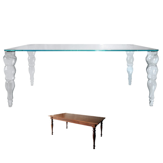
In the meantime, I had been carrying around the New York Magazine Home Design issue in my purse for a week because I had intended to blog about the amazing Neo-Country piece that got my creative juices flowing. Not only was I in love with the clean, mid-Century Modern room that perfectly integrated hand-made wooden pieces that were rustic-inspired but with modern finishes, but the "Neo Classics" spread in which the classic shapes of farm tables and Baroque frames are made of unexpectedly modern materials such as glass and plastic had me itching to completed redecorate my house. NY Mag said it so perfectly... it is the "new old." And it works.


Rustic materials are the highlight of this room, which does not feel at all rustic.


As much as I love the shape of the classic farm table, it would have no place with my more contemporary home aesthetic. The glass re-imagining of it is both modern and classic at once giving it new life.


Bright colors free these frames from their traditional roots while the shape pays homage to a classic style.

Why do these unlikely matches come together to create a whole that is superior to the sum of its parts? The best way I can explain it is to compare it to baking... have you ever wondered why recipes for cookies, cakes and pies call for at least one big, heaping teaspoon of salt? The salt brings out the sweetness in the other ingredients and heightens the strengths of their flavors.

It is easy to group things together which are the same - we are taught to do that basically from birth. And I distinctly remember learning what the word "clash" meant when a classmate teased another friend about wearing a pink shirt with red pants. But the thing is that when you limit yourself to only combining things that have elements of sameness or that organically "go together," you run out of options pretty quickly.

This applies not only to decor but to the other most important components of any event: music and food. A music trend that is beginning to run its course is classical string instruments playing contemporary music for a wedding ceremony... an unlikely match of modern melody and classic instrument makes an impact far greater than the music "expected" to emanate from a violin. And, if you watch Top Chef (or any cooking show) you know that you can't win unless you know how to put bacon in a dessert! Seriously. Bacon. In. Dessert.

The truth is that if you can finish the sentence without all of the words, the sentence doesn't even need to be said aloud. But, when the end of the story takes you to a place you never expected, you are riveted, and the story settles into your mind.

Why, oh, why have I told you all of this? Because I spend my days trying to create decor that sticks with you. More than just beautiful, I am after a look that is memorable. Does it always have to be accomplished with an unusual pairing? Certainly not. But it must be well-enough thought out that the choices appear to be conscious since I believe that something with that amount of power will find its way into the consciousness of another. Just like how Snoop meandered his way into my mind and into my blog.

Inspiration is everywhere.

Friday, January 29, 2010

Inspired by... Hotels

I think the majority of designers in the event industry trace a lot of their inspiration back to fashion... at least that is what I hear and read from my peers most often. While it is not to say that I am not inspired by fashion (I do love it), I am not moved by it in the same way that I think many designers are. I am so much more taken by environments - how unrelated things work together to define space or how textures and colors (or lack thereof) create context for life, movement and activity.

Some of the most inspiring environments for me are in hotels, and for good reason, as I actually see quite a few similarities between the design of a hotel and the design of an event. Like an event, a hotel must be designed to appeal to a large group of diverse individuals with different tastes, and still make them all feel comfortable as well as entertain them in a luxurious manner. Hotels, like events, are not solely created to be design environments - they are created for other purposes, so guests entering may not be looking for the nuance and intricacies of the design. As a result, often bolder or bigger elements must be introduced to capture the attention of the guests and give them a "wow." Finally (well, not really finally, but finally for this post!), both hotels and event environments have multiple related spaces which need to have a connected vision, but also an evolution of style for the guest to experience. Think: lobby, hallway, guestroom vs. ceremony, cocktails, dinner.

While there are so many hotels that I adore and that really move me, I can't stop pouring over the photos of the Crosby Street Hotel here in New York City. I was introduced to the parent company, Firmdale Hotels, on my trip to London last summer (I stayed in the Soho Hotel) and was OBSESSED with the decor in my room as well as the common spaces in the hotel. When I learned that Firmdale recently opened a property here, I was enthralled. Co-owner and designer Kit Kemp mixes colors, textures and even eras with ease and there are no two rooms in the seven hotel properties that are identical.


Hotel lobby: eclectic, but not intimidating

The personality of the designer shines through so you can see a connectivity between each property and each room, yet the individuality of the hotel based on location, size and client base is the guiding light of the design. It always has been and will be my goal to do the same... to use my client and the venue to give me the inspiration for the painting, but then to finish it off with my signature frame.


Common spaces: bold, but still inviting


Bedrooms: glamorous, but still comfortable