Monday, December 31, 2012

Carolyn and Jeff: Sophisticated City Wedding

This, my friends, was a great wedding! Loads of cool details, a truly creative layout and a couple who wanted a wedding that was, let's say, ALL IN. No stone left unturned.  

Carolyn and Jeff wanted a wedding that screamed NYC from every angle, so the selection of the venue was paramount. After checking out almost every venue in the City and changing their wedding date to accommodate the venue's availability, they selected the sleek and modern Trump Soho Hotel for all of their wedding events - from a Friday evening welcome cocktail party to a Sunday morning farewell brunch. 

The ceremony was the bride's terrain... she had the strongest vision for this atmosphere, so we knocked it out of the park from the first rendering. Carolyn wanted it to be both modern and warm so we used lots of minimalistic elements like ghost chairs and a slim fabric chuppah, but then created tons of glow with a pair of candle walls and candles down the aisle. The lighting was set like a theater - really dark except for the "stage" so the photos don't show the whole essence... I included our initial rendering so you can see some more!


Cocktail hour was set to be a divergence from the romantic ceremony with a lively, fresh summer atmosphere. We used lounge pieces for most of the seating as well as a huge bar detailed with the mod pattern that we introduced with the custom invitations we designed for Carolyn and Jeff. 


For the escort card table, we built another candle wall as the backdrop and then used grass green cards with white calligraphy by Michael Weinstein on a gorgeous brown ostrich table from Party Rental, Ltd.


The dining room was, I must admit, one of our biggest challenges - and one of our biggest successes. As it happens with many events, the couple's guest list grew significantly throughout the planning process, so we were faced with the challenge of fitting the room to its capacity without sacrificing all of the creative layout and design concepts we had been working toward. The most economical way to use a space is to fill it with round tables (which is why they are the standard at most venues), but Carolyn and Jeff didn't want a traditional dining environment or a traditional sit-down menu. So, we designed a supper club style dining room with a mix of some long feast tables along with some tall bar style tables, banquette tables and lounge groupings. On top of that, we had 3 huge food stations in the room. In short, the least space efficient design possible. But... we used every inch and made it work. And it was pretty fabulous if I may say so myself!


Each table type had different floral collections. Long tables had lush bouquets of lavender roses, green orchids and white tulips mixed with architectural arrangements of white calla lilies, whereas the bar and banquette tables had collections of singular blooms including purple callas, green hydrangea and white orchids. The circle was a common theme throughout the design so we used circle patterned votives and even a dot patterned gobo to cast an ethereal, sparkly glow over the entire room.


Many tables in the room were white lacquer rather than covered with linen, so to warm up the surfaces and give them greater connectivity to the darker elements in the room, we designed wooden table runners and adhered them to the white tables, giving the look that the wood was inlayed in the white table. These were crazy-cool... hopefully you can get a little taste of it.


2012 was such an amazing year for LLE... our events were bigger, better, more creative and more exciting than ever before. I am unendingly grateful to every client who put their trust in me to make the most special days of their lives even more unique and beautiful.  And, I am infinitely indebted to my outstanding team of designers, planners, interns and producers, without whom not one event this year would have been possible. I don't know how I got so lucky, but I have the absolute best people in the event biz on my crew, and they faithfully stand behind me and enthusiastically support my crazy ideas, all in the name of making pretty parties. 

So, on this final day of 2012, thank you, thank you, thank you. Wishing you health, happiness and many celebrations of joy in the new year!

xo,


Wednesday, November 21, 2012

Noah's Bar Mitzvah: Made for Movies

I love when my job allows me the opportunity to visit New York's best/coolest/most unusual cultural spots that ordinarily I don't get a chance to see. I didn't even know that the Museum of the Moving Image existed until we were looking for the perfect venue for a movie-buff teen with film biz parents. What could be a better fit than this unbelievably sleek space with something for everyone who has ever liked any kind of movie - ever. Star Wars gallery? Check. Silent film theater? Check. Animation studio? Check. Retro video arcade ('cuz who didn't play arcade games while you were waiting for your parents to pick you up from the movies!)? Check!

Noah's family didn't want a traditional, sit down meal with a lot of program formalities for their celebration, so we created a cocktail environment in the MMI foyer and cafe which provided lots of seating and food stations, but allowed guests to move and mosey throughout the night. Cocktail hour was in the galleries so guests could experience all of the cool stuff that the museum has to offer and the kids loved having a second opportunity to hit that arcade later in the night while the adults enjoyed a little "grown up" time. 

 For a Bar Mitzvah, I always like to use unusual, funkier flowers so that they don't feel too feminine. Here we used green antherium, dendrobium orchids and cymbidium orchids along with green and white parrot tulips and steel grass.  This fun vase was slightly reminiscent of a film reel - or so we thought!

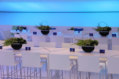
Smaller tables had cocktail-sized arrangements with cymbidiums and spider mums. We were fortunate that the museum was furnished with these cute triangular white tables that looked a bit like "play" buttons and fit right into our design! All vases were detailed with vinyl film strip appliques. 


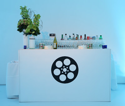
The cocktail bar was in a totally white space, so we kept it super-sleek with only a film reel vinyl applique that we custom designed for Noah.  

 Ottomans were enhanced with custom pillows for extra seating.

 Long communal tables detailed with black vinyl film strips allowed guests to hang out together in a relaxed setting. 

All photos by Gustavo Campos
This innovative video wall exhibit really set the scene and added the flavor of the museum to the party as it changed throughout the night. 

What I can't show you here (mostly because I am somewhat technically inept) is the absolutely unbelievable films that Noah and his parents created for both the video save the date and for the night of the party which premiered in the Museum of the Moving Image's stunning theater. When I think about this family and this venue, I cannot fathom a more perfect match. Boy, do I love it when a plan comes together...

 Happy Thanksgiving!


Monday, November 12, 2012

Checkerboard Fusion Album: Inspired by Invitations, Part 3

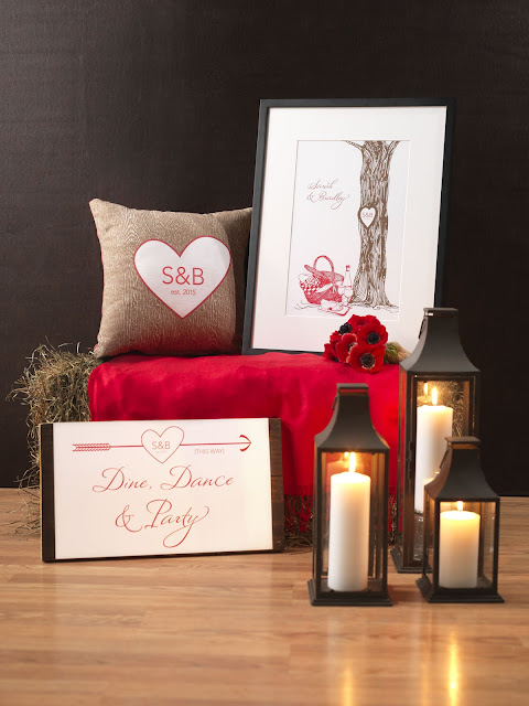
This next design for the Fusion shoot was just plain fun... instead of putting together a traditional wedding dinner setting, we designed a rustic dessert table inspired by the "Entwine" collection from the Checkerboard Fusion Album. 


I wanted to incorporate as much texture as possible so we used bushels of hay for the benches (covered with pashminas), burlap ribbon and fabric on the table and wrought iron trays and lanterns. 

 We featured more tote bags accented with the Love logo and personalized tags along with monogram favor boxes from the Fusion album. 

 When creating a great dessert table or any type of food station, I think it is important to use varied containers and trays on various levels, but to maintain some symmetry in the design so that it doesn't feel busy and haphazard. Treading the fine line between interesting and chaotic is sometimes a challenge!


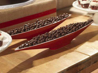
 I loved these "canoe" bowls from Mikasa!

Checkerboard introduced these adorable cookie cutter favors - and what better place to display them than amongst the desserts!
 
 Throw pillows can have a place at a wedding or special event and then you can continue to use them at home. If your venue has existing furniture - even if it doesn't match your color scheme - you can accessorize it with your own pillows and throws (pashminas are always easy and inexpensive) to give a personalized touch.


 Also available in the Fusion album is event signage and gorgeous framed wall art so you can have a piece of your wedding beauty at home.

After the shoot, we got to stock the Checkerboard breakroom with all of these amazing goodies, so have no fear - not a morsel went to waste!


Friday, November 9, 2012

Checkerboard Fusion Album: Inspired by Invitations, Part 2

Next up in our series showcasing our fantastic collaboration with Checkerboard, is a soft and romantic design inspired by the "Harmony" collection from the Fusion Album.  The invitation itself has a very classic feel and the floral accents give it a softness and femininity that I wanted to carry through to the tabletop.


 There is no time like the present to acknowledge the importance of font selection. I am CRAZY about fonts and choosing just the right one can truly set the tone for your celebration. I personally look for script fonts that have a very thin point/weight and that have a more calligraphic/hand drawn feel. The font used for the bride and groom's names is what initially drew me to this collection.


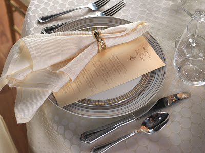
Elements like the gold chiavari chairs, neutral colors and crystal candlesticks give this look a classic vibe, whereas the geometric accents on the linen and china along with the use of a stemless wine glass, offer a modern touch.  The drape of the napkin in the gold ring is a nod to the soft cinched ribbon on the invitation.


 A crystal, footed vase is filled with ivory garden roses, blush and pink roses, white hydrangea and hyacinth.


 The tone on tone polka dot tablecloth from Party Rental Ltd would be perfect for a daytime wedding; for an evening affair, you could use a champagne dupioni or bengaline for added formality. Mikasa provided the contrasting pattern rimmed china accented with a blush shimmer personalized menu.


 One of my favorite offerings from Checkerboard in this album are the personalized guest books. My clients always find it so hard to find a great one and this is simple and beautiful.  Behind it is an amazing keepsake platter that can help you bring a piece of your wedding design into your home.

Stay tuned for more from this fun photoshoot! Happy weekend!


Wednesday, November 7, 2012

Checkerboard Fusion Album: Inspired by Invitations, Part 1

I was endlessly honored when I was approached by national invitation and stationery company Checkerboard, Ltd. to collaborate with them on their newest collection of invitations and their newest innovation to accompany them.  The Fusion Album by Checkerboard is not only filled with beautiful wedding invitations but also what they call "Event Adjacencies" - items that accompany an invitation suite to carry the look of the invitation into the event itself.  This is, as Checkerboard says, is "The Future of Inviting."

It was so exciting to be a part of the creative process with the Checkerboard design and marketing teams, giving them insight into what my clients look for when creating the designs for their events, what types of products are absent from the "adjacency" market and how an invitation can become true inspiration for an entire event. I loved learning from their teams about the development process of an invitation suite and watching this album be built from the ground up... and then watching it launch into the hands of stationery dealers around the world at the National Stationery Show!

As a way to show stationery dealers and customers how the adjacencies worked to created a holistic event concept, my team and I produced a HUGE multi-day photoshoot at the Checkerboard headquarters in West Boylston, Massachusetts. Along with the Checkerboard team, we selected five invitation suites to use as inspiration for a wedding look.  Here's our first look... others to follow in coming posts!

The "Vast" invitation ensemble was our inspiration.

And this was the look we created!
 Printed tote bags with personalized hang tags are one of the Checkerboard adjacencies available.  Perfect for hotel welcome gifts or bridesmaids' thank yous. 

 Layered navy patterned plates were provided by Mikasa. Wave place cards and monogrammed favor boxes are featured - both available from the Fusion collection.

 Silk runners from Party Rental Ltd. ran crossways on the table adding contrast between the white linen and white napkin.  Personalized coordinating menus just lay simply on the plate.

Bright yellow spring flowers added a contrast color to the palette. We detailed the vases, candles and chairs with navy and white striped ribbon from our last nautical-inspired event!


A little tip on using your invitation for inspiration... you don't have to match everything to the invitation in order to build a design around it.  Allow yourself the freedom to add new pops of color (in this case, the yellow flowers) or other graphic elements (the wave on the placecards or the polka dots on the plate) to add depth and interest. Give your design a little room to grow and you'll be amazed!


Wednesday, October 31, 2012

Surprise Winter Birthday Soiree

With only a few weeks' notice, we were invited to create a glimmering holiday-inspired SURPRISE birthday celebration at one of New York's most storied restaurants. The guest of honor's favorite spot is the famed Four Seasons restaurant in NYC so we used some of the best qualities of the space to design a sparkling winter dinner party.

The "water table" escort display that I originally designed for Lauren and Nick was a natural fit for this party since the miniature pool surrounded by lush white flowers echoed the large, beautiful pool that stands as the centerpiece of the Four Seasons restaurant. 


The private dining room at the restaurant is defined partially by its large and dramatic Pop Art pieces. To counter that and create a warm and serene environment, elegant lighting was crucial. We washed the room in amber light and then used a candlelight colored pattern wash over the entire space to create a sparkly effect.


We mixed round and rectangular tables throughout the room to help the guest of honor and the host re-imagine a space that they had been to dozens and dozens of times. This is the best way to make a familiar space feel new again.


Simple white floral landscapes mixed with mercury glass finial trees integrated a nod to the holiday season with a simple festive design that was not overly feminine for the male guest of honor.


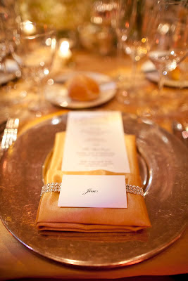
The host loved the antique silver chargers that the Four Seasons provides - they were the base of the silver and gold palette that we used for the entire event. Silver and gold was mixed throughout including the use of silver chairs and gold cushions and gold napkins with silver crystal napkin bands. 


Thank you to Judith Rae for these beautiful photos!